Tuesday, December 15, 2009


After working with the article "How Good is Good?" I realized that things just wern't working out the way I had wanted or planned. I still think that article was more interesting for the reader, but the paragraph format in "Abstracting the Essence" was what I was really looking for. This article, by Emily King in 1993, is about Graphic Designers making movie posters for films. In the beginning the posters were boring without much character because they had kept the same style from 1930's to the beginning 1950's. It said that independent producers could start making their own movie posters/pictures and let them be seen by the world. King speaks of Saul Bass and Otto Preminger making these designs and films; Bass designing and Preminger producing film.

Sunday, November 29, 2009

Project 4

_What are the advantages of a multiple column grid.?
Gives the designer a more possibilities for their work while also maintaining order. This also can provide grouping for different information. Things can be aligned to one another, you can vary the width (flexible).

_ How many characters is optimal for a line length? words per line?
around 45 to 75 characters. (60 average)

_ Why is the baseline grid used in design?
It creates order and helps the reader understand the text easily.

_ What is a typographic river?
When a composition of text is put together and spaces within line up creating a white line down your text distracting from the content.

_ How can you incorporate white space into your designs?
White space can be achieved by not filling the entire page in type color or graphics. Leaving this extra space gives your eye a break while also making your design more visually appealing. This is so a page will not be completely filled.

_ What is type color/texture mean?
means the boldness or weight of a typeface. To get this you could increase the tracking or leading,

_ What is x-height, how does it effect type color?
x-height is the size of the font. a smaller x-height will look lighter then a font with a large x-height.

_ In justification or H&J terms what do the numbers: minimum, optimum, maximum mean?
minimum, optimum, and maximum all refer to the space between words. minimum being the least and optimum being the best possible.

_ What are some ways to indicate a new paragraph. Are there any rules?
a new paragraph could be in a different color, have a different alignment, kerning, etc.

_ What are some things to look out for when hyphenating text.
you have to be careful what type of dash you are using. an en dash is used for years where as an em dash is used if you need to change a thought. A hyphen should only used in words and line breaks.

_ What are ligatures?
it prevents letters from interfering with another letter's space

_ What does CMYK and RGB mean?
CMYK stands for the colors cyan, magenta, yellow, and black
RGB stands for the colors red, green, and blue

_ What does hanging punctuation mean?
can be seen in quotation marks on the outside as to not disrupt the structure of the text itself.

_ What is the difference between a foot mark and an apostrophe?
a foot mark is a strait hash usually indicating a measurement whereas an apostrophe has a curve, usually used in words to show a contraction

_ What is the difference between an inch mark and a quote mark (smart quote)?
an inch mark would be a foot mark (strait) and quote marks are curved.

How Good is Good?

How Good is Good is a great article about Graphic Design and what it really means. Many of these thoughts I have had myself, but never could actually think of it in such words, which made this short read very interesting for me. This piece throws out thoughts in comparing 'good' design to 'bad' design. Saying good design with a bad purpose will equal a bad outcome and bad design with a good purpose probably wont do that well either. But it also gets the reader to think about exactly what it is that they are designing for; should they rather be called a 'commercial designer' that sells an idea, or a 'Graphic Designer' that makes people aware. A lot can be said through that last sentence. Graphic Design has a major impact on people and used in the right way can be a very moving and strong pull on society. I think it enlightens designers to do work hard making a good desing that means something to them and can make a difference rather than creating some useless or destructive piece of design.

Wednesday, November 25, 2009

Project 3 Webpage for Type

http://www.people.ku.edu/~cberry07/cberry_flash09/

Sunday, November 1, 2009

Tuesday, October 13, 2009

Sunday, October 11, 2009

Wednesday, September 30, 2009

Goudy


2-
Goudy is a typeface designed by Frederic Goudy who lived from 1865 to 1947.

3-
the Goudy font was designed in 1915

4-
Goudy is classified as Old Style

5-
In typography, Old Style is a style of font developed by Renaissance typographers to replace the Blackletter style of type. Based on ancient Roman inscriptions, these fonts are generally characterized by low contrast between thick and thin strokes, bracketed serifs, and a left-leaning axis or stress.

6-
Other fonts also in the Old Style classification are Garamond, Centaur, and Sabon

7-
Things going on in 1915 when Goudy was created were:
Alexander Graham Bell inaugurates U.S. transcontinental telephone service.
Pluto is photographed for the first time but was not recognized as a planet.
WWI
Denmark amends its constitution to allow women's suffrage.
Former cartoonist John B. Gruelle is given a patent for his Raggedy Ann doll.
Woman's suffrage: In New York City, 25,000-33,000 women march up Fifth Avenue to demand the right to vote.
Albert Einstein publishes the general theory of relativity.

8-
Frederic Goudy created many font families including:
Berkeley Oldstyle
Copperplate Gothic
Village

9-
life of Fredric Goudy:
(http://en.wikipedia.org/wiki/Frederic_Goudy)
Frederic W. Goudy (1865–1947) was a prolific American type designer fonts include Copperplate Gothic, Kennerley, and Goudy Old Style. . He also designed, in 1938, University of California Oldstyle, for the sole proprietary use of the University of California Press. The Lanston Monotype Company released a version of this typeface as "Californian" for wider distribution in 1956, while ITC created a digital version, called ITC Berkeley, in 1983.
In 1903, Goudy and Will H. Ransom founded the Village Press in Park Ridge, Illinois. This venture was modeled on the Arts and Crafts Movement ideals of William Morris. It was moved to Boston, then New York. In 1908, he created his first significant typeface for the Lanston Monotype Machine Company: E-38, sometimes known as Goudy Light. However, in that same year the Village Press burned to the ground, destroying all of his equipment and designs. In 1911, Goudy produced his first "hit," Kennerly Old Style, for an H. G. Wells anthology published by Mitchell Kennerly. His most widely used type was Goudy Old Style.
From 1920 to 1947, Goudy was art director for Lanston Monotype. By the end of his life, Goudy had designed 122 typefaces and published 59 literary works. Goudy was the originator of the well-known statement, "Anyone who would letterspace blackletter would steal sheep
Goudy wasn't always a type designer. "At 40, this short, plump, pinkish, and puckish gentleman kept books for a Chicago realtor, and considered himself a failure. During the next 36 years, starting almost from scratch at an age when most men are permanently set in their chosen vocations, he cut 113 fonts of type, thereby creating more usable faces than did the seven greatest inventors of type and books, from Gutenberg to Baramond.
Asked how to say his name, he told The Literary Digest "When I was a boy my father spelled our name 'Gowdy' which didn't offer any particular reason for verbal gymnastics. Later, learning that the old Scots spelling was 'Goudy,' he changed to that form, while I, for some years, retained the old way. My brother, in Chicago, still spells with the w. However, I find that occasionally a stranger pronounces the word with ou as long o in go, sometimes as ou in soup, or goo and less frequently with the ou as oo in good. I retain the original pronunciation with ou as in out."

Some important dates in the life of Goudy were:
(http://www.linotype.com/396/fredericwgoudy.html)
1888: book-keeper for credit and mortgage companies. 1889: moves to Chicago, works in real estate. 1892: launches "Modern Advertising" magazine which issues only a few numbers. 1895: opens a print workshop in Chicago and prints the "American Chap-Book". 1897: designs his first type, Camelot Old Style. Produces typographical designs for various publishing houses and companies. 1903: founds the Village Press. The first publication is an essay by William Morris. 1904: his publications are awarded prizes at the world exhibition in St. Louis. 1908: the Village Press is destroyed by fire. 1909: the Press is reopened and run under Goudys management in Forest Hills. 1914: signs a contract with the American Type Founders Company governing the manufacture and use of his typefaces. 1916: sells 8 new typefaces to the Caslon type foundry in London. Numerous companies commission Goudy™ to design exclusive typefaces for them. 1920–40: art consultant to the Lanston Monotype Co. 1924: he and his publishing house move to Marlborough-on-Hudson. 1925: opens his own type foundry. 1939: the workshop for type design, type cutting, type foundry, typesetting, printing and bookbinding are destroyed by fire. 1940: teaching post for calligraphy at the University of Syracuse. 1947: the Goudyana exhibition is opened in Goudy’s presence at the Library of Congress in Washington. Goudy designed a total of 116 fonts and published 59 literary works.


10-
Goudy once said “Once in a while a type face boy some other designer seems to present an interesting movement or quality that I like. I take an early opportunity to make it mine, frankly and openly, in the same way that a writer might use exactly the same words as another, but by a new arrangement of expression.”


http://www.linotype.com/396/fredericwgoudy.html
http://en.wikipedia.org/wiki/Frederic_Goudy
http://www.spiritus-temporis.com/1915/

Thursday, September 24, 2009

Classifications of Fonts

Define Font Classification in general terms.
A basic system for classifying typefaces was devised in the nineteenth century, when printers sought to identify a heritage for their own craft analogous to that of art history. Humanist letterforms are closely connected to calligraphy and the movement of the hand. Transitional and modern typefaces are more abstract and less organic. These three main groups correspond roughly to the Renaissance, Baroque, and Enlightenment periods in art and literature. Designers in the twentieth and twenty-first centuries have continued to create new typefaces based on historic characteristics.

Classifications:
Old Style-
In typography, Old Style is a style of font developed by Renaissance typographers to replace the Blackletter style of type. Based on ancient Roman inscriptions, these fonts are generally characterized by low contrast between thick and thin strokes, bracketed serifs, and a left-leaning axis or stress. There are two groups of Old Style typefaces: Venetian (Renaissance) and Garalde (Baroque). Examples are: Garamond, Centaur, Goudy Oldstyle, Century Oldstyle, Palatino, Sabon

Transitional- The Antiqua or Old Style of type of the 16th centuries evolved into a style known as Transitional. The primary characteristics of Transitional type is medium contrast between thick and thin strokes, less left-inclined stress than earlier Old Style faces, and a triangular or flat tip where diagonal strokes meet (such the base of a W) Examples are: Baskerville, Times New Roman, Bell, Perpetua.

Modern-
In typography, Modern is a style of typeface developed in the late 18th century that continued through much of the 19th century. Characterized by high contrast between thick and thin strokes and flat serifs, Modern fonts are harder to read than previous and later typestyles. Some later variations include the Slab Serifs with bolder, square serifs and the related Clarendon style with less contrast and softer, rounded shapes. Examples are: Bodoni, Didot, Bernhard Modern Roman

Slab Serif- A Slab Serif is a type of serif font that evolved from the Modern style. The serifs are square and larger, bolder than serifs of previous typestyles. Considered a sub-classification of Modern, Slab Serif is further divided into Clarendon, Typewriter, and Slab Serif (a separate sub-category of Slab Serif) styles. Examples are: Clarendon, American Typewriter, Rockwell

Sans Serif- Type which does not have serifs -- the little extra strokes found at the end of main vertical and horizontal strokes of some letterforms -- are called sans serif (without serif). Within sans serif there are five main classifications: Grotesque, Neo-Grotesque, Geometric, Humanist, and Informal. Typefaces within each classification usually share similarities in stroke thickness, weight, and the shapes of certain letterforms.

Although there were some sans serif typefaces in the 1800s, the 1920's Bauhaus design movement popularized the sans serif style.

Examples are: Arial, Helvetica, Verdana, Futura, Univers, and Franklin Gothic

Script: are based upon the varied and often fluid stroke created by handwriting. They are organized into highly regular formal types similar to cursive writing and looser, more casual scripts. expamles are: Kuenstler Script, Caflisch Script, Shelley, Coronet, Snell Roundhand, Park Avenue, Present Script, Freestyle Script and Commscript.

Blackletter:Based on early written forms, blackletter is a style of typeface that features elaborate thick to thin strokes and serifs. The Gutenberg Bible, the first book ever printed with movable type, was set in a Blackletter typeface to mimic the manuscript writing of the time. Examples are: Black Forest, Linotext, Goudy Text, and Wedding Text

Monospaced:The sole criterion of a monospace font is that all glyphs have the same fixed width. (This can make some scripts, such as Arabic, look most peculiar.) The effect is similar to a manual typewriter, and is often used to set samples of computer code. Examples are: Courier, MS Courier New, Prestige, Everson Mono,

Grunge: A catch-all phrase to describe a typographic wave in the 1990s. Grunge, like many typographic/artistic movements before it, was a rebellion; but this rebellion denied not only the relevance of anything previous, but sometimes even the relevance of legibility itself, in the belief that the medium *is* the message. As grunge type designer Carlos Segura of T-26 says, “Typography is beyond letters. Some fonts are so decorative, they almost become ‘visuals’ and when put in text form, they tell a story beyond the words — a canvas is created by the personality of the collection of words on the page.” Grunge typefaces and typography were seen in magazines such as RayGun and Bikini.


Wednesday, September 9, 2009

Baskerville and Frutiger


John Baskerville was born in 1706 and around the time he was seventeen he had already started dealing with fonts, working on engraving tombstones. Once he got a couple years older he then started teaching writing did bookkeeping and ran an engraving business. When he was thirty-two he started a popular, at that time, lacquering process called japanning which in turn made him wealthy. Once Baskerville was forty-four he started doing all of the things that he is known for today. After working on fonts for four years he finally produced the Baskerville font. During this time Baskerville made a new ink and used the new high quality woven paper to create ‘fine’ printing.
Cambridge University Press hired him to be their printer where he eventually made a Bible. The contradiction was Baskerville was an atheist and never married his lifelong partner. During the eighteenth century this was a really big deal as opposed to today.
Because he was so against religion he wanted to be buried on his own land, not in a cemetery. After the house went through the Birmingham riots, the new owner wanted a canal through the property and during this the workmen found Baskerville’s coffin. Now Baskerville rests in Warstone Lane Catacombs.
Why is Baskerville “unique”
Baskerville font is unique because it was developed and executed in a very specific way that the letters were made with good sized contrast in the thickness of the line. Also he worked on readability, making the serifs of the type narrow.

Adrian Frutiger was an illustrator, but more widely known for being a typographer. He created the Universe typeface. Making this font, he was creating it with one major goal in mind; to not distract the eye with serifs or anything embellishing it. He wanted an easy flowing read. Thus he created the, san-serif, Universe font. The other major accomplishment Frutiger had was creating the Frutiger Grid. This grid was created and made for the reader to know exactly how a font would look depending on its font weight, width, and weather it is roman or oblique. The grid assignments each option to numbers. The first number represents the weight, and the second meaning width and roman or oblique. Obviously Universe font was the first to be used in this grid system, but since then many fonts are still thought of from their assignment on Frutiger’s grid.

Monday, August 31, 2009

Typography 01 - second assignment definitions

01 - absolute measurement - measurements of fixed values. They cannot be altered and are used to show a physical distance.

02 - relative measurement- this is how the relationships in measurement such as character spacing, are linked to the type size.

03 - point- refers to the height of the type block.

04 - pica - unit of measure. It is 1/6th of an inch and contains 12 point units of measure.

05 - em (and em dash) measurement used in typesetting to define basic spacing functions. It is linked to the size of type. Increases with increased type size

06 - en (and en dash) - unit of relative measurement equal to half of one em

07 - legibility - term refers to how easily a type can be read.

08 - rag- this is when shapes form by the line ends of text blocks and distract from the reading.

09 - type alignments: flush left, flush right, centered, justified. list advantages and/or disadvantages - alignment is how the text is arranged upon the page according to any one of the four main forms of alignment.

10 - word spacing: what is the ideal - the space between words normally is based upon a space equivalent to the body width of a lowercase I.

11 - rivers - these normally occur in justified text blocks when the separation of the words leaves gaps of white space in several lines. Ther ‘river’ is created where the white space gaps align through the text.

12 - indent - text can be indented so that some or all of the text lines are moved in from the margin by a specified amount.

13 - leading - used specify the depth of space between lines.

14 - kerning - incorporates inbuilt automatic adjustments to the spacing of particular letter pairs that would otherwise create disproportionate spaces.

15 - tracking - letter spacing

16 - weight - the thickness of the type. Can be black, ultra bold, etc.

17 - scale- size of the font in the point system.

18 - typographic variation- font and font sizes and the look of these fonts at their different sizes

19 - orphan - the final one or two lines of a paragraph separated from the main paragraph to form a new column

20 - widow - a lone word at the end of a paragraph

Tuesday, August 25, 2009

Typography 01 - First Assignment

info found at:
dictionary.com
http://www.doulos.com/knowhow/verilog_designers_guide/a_design_hierarchy/


Define the word Grid-
A pattern of regularly spaced horizontal and vertical lines forming squares on a map, a chart, an aerial photograph, or an optical device, used as a reference for locating points.
Why do we (Designers) use a grid? what are the benefits or functions?
The reason we use the grid system in Typography is because it was made to “eliminate the confusion caused by different naming systems…and provides a sense of order…through the relationships that weight and width have with each other.” Typographic grids are specifically made to create order and control.
What is a modular grid?
A modular grid contains columns and rows. The modules help in the placement/cropping of your text and pictures, but the images and texts can always take up more than one module as well.
Define and illustrate:margins,columns, grid modules. flowlines, gutter
Margins- a border or edge, typically around printed or written matter

Columns- a vertical arrangement on a page of horizontal type.

Grid modules-they are areas that help in the placement of your text or images.

Flowlines-lines of the modules

Gutter-the areas around the modules that are not on the edges of the page as those are margins
Defien hierarchy
Hierarchy- in design this is when modules reference other modules.

What are ways to achieve a clear hierarchy

Hierarchy can be achieved clearly by making one module bolder, darker, more colorful, to the right, etc. Define type family and type styles Type family- is a collection of related typefaces which share common design traits and a common name.
Type Styles- any given variant of this coordinated design

Josef Muller Brockmann is...
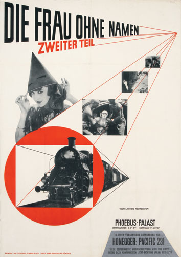
Josef Muller Brockmann was a swiss Graphic Designer, known for the use of the grid. Brockmann had studied architecture, design, and art history in Zurich. He did many things in his life including being a liutenant in the Swiss army. After the army he continued his work as a designer, but mostly exhibition design and illustration and working as a set designer for theatres in Switzerland
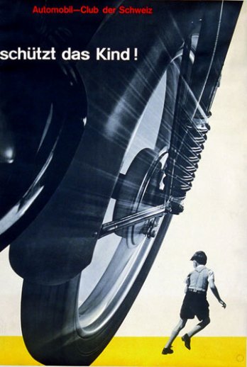
. In 1936 he had opened his own studio for his design, but also featuring some photography. His first really big poster success was for "Watch that Child!" for the Swiss Automobile Club and poster series for the Zurich Tonhalle. Then in 1958 he became the founding editor of New Graphic Design. After this he continued to grow as an artist and have lots of success. He eventually published a couple books and did lectures all over untill he died in 1996.


Jan Tschichold is...

Jan Tschichold, who was born in Germany, was the great typographer that created the well known typeface Sabon. Sabon was named after the sixteenth century type founder, Jacques Sabon. Besides this he also had brought about Transit, Saskia, and Zeus. The site, http://new.myfonts.com/person/Jan_Tschichold/, contains five font families by Tschichold; sabon (from adobe), Iwan Reschniev, Classical Garamond, Tschichold, Sabon (from Linotype). During his lifetime he, Jan Tschichold, also did calligraphy, book design, book jacket design, writing (he wrote a book on design titled Die neue Typography), lettering, and was a teacher. Jan more then likely became interested with scripts due to his childhood and growing up with his father, Franz Tschichold, being a script writer. Jan originally became a drawing teacher making calligraphic writings in his spare time, and quitting his teaching career after three years when he decided becoming a typeface designer was more along his lines. So he attended the Academy for Graphic Arts in Leipzig. Once he graduated he then became an instructor at this academy. He continued teaching until the Nazis arrested him in 1933 for “culturally subversive” activities. During this time the practice of making new typography was considered a subversive activity because it was different. Later his organized form of typography was called the tschichold grid.