01 - absolute measurement - measurements of fixed values. They cannot be altered and are used to show a physical distance.
02 - relative measurement- this is how the relationships in measurement such as character spacing, are linked to the type size.
03 - point- refers to the height of the type block.
04 - pica - unit of measure. It is 1/6th of an inch and contains 12 point units of measure.
05 - em (and em dash) measurement used in typesetting to define basic spacing functions. It is linked to the size of type. Increases with increased type size
06 - en (and en dash) - unit of relative measurement equal to half of one em
07 - legibility - term refers to how easily a type can be read.
08 - rag- this is when shapes form by the line ends of text blocks and distract from the reading.
09 - type alignments: flush left, flush right, centered, justified. list advantages and/or disadvantages - alignment is how the text is arranged upon the page according to any one of the four main forms of alignment.
10 - word spacing: what is the ideal - the space between words normally is based upon a space equivalent to the body width of a lowercase I.
11 - rivers - these normally occur in justified text blocks when the separation of the words leaves gaps of white space in several lines. Ther ‘river’ is created where the white space gaps align through the text.
12 - indent - text can be indented so that some or all of the text lines are moved in from the margin by a specified amount.
13 - leading - used specify the depth of space between lines.
14 - kerning - incorporates inbuilt automatic adjustments to the spacing of particular letter pairs that would otherwise create disproportionate spaces.
15 - tracking - letter spacing
16 - weight - the thickness of the type. Can be black, ultra bold, etc.
17 - scale- size of the font in the point system.
18 - typographic variation- font and font sizes and the look of these fonts at their different sizes
19 - orphan - the final one or two lines of a paragraph separated from the main paragraph to form a new column
20 - widow - a lone word at the end of a paragraph
Monday, August 31, 2009
Tuesday, August 25, 2009
Typography 01 - First Assignment
info found at:
dictionary.com
http://www.doulos.com/knowhow/verilog_designers_guide/a_design_hierarchy/
Define the word Grid-
A pattern of regularly spaced horizontal and vertical lines forming squares on a map, a chart, an aerial photograph, or an optical device, used as a reference for locating points.
Why do we (Designers) use a grid? what are the benefits or functions?
The reason we use the grid system in Typography is because it was made to “eliminate the confusion caused by different naming systems…and provides a sense of order…through the relationships that weight and width have with each other.” Typographic grids are specifically made to create order and control.
What is a modular grid?
A modular grid contains columns and rows. The modules help in the placement/cropping of your text and pictures, but the images and texts can always take up more than one module as well.
Define and illustrate:margins,columns, grid modules. flowlines, gutter
Margins- a border or edge, typically around printed or written matter
Columns- a vertical arrangement on a page of horizontal type.
Grid modules-they are areas that help in the placement of your text or images.
Flowlines-lines of the modules
Gutter-the areas around the modules that are not on the edges of the page as those are margins
Defien hierarchy
Hierarchy- in design this is when modules reference other modules.
What are ways to achieve a clear hierarchy
Hierarchy can be achieved clearly by making one module bolder, darker, more colorful, to the right, etc. Define type family and type styles Type family- is a collection of related typefaces which share common design traits and a common name.
Type Styles- any given variant of this coordinated design
Josef Muller Brockmann is...


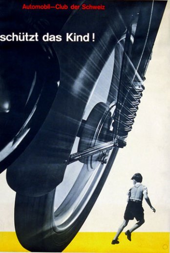
 Josef Muller Brockmann was a swiss Graphic Designer, known for the use of the grid. Brockmann had studied architecture, design, and art history in Zurich. He did many things in his life including being a liutenant in the Swiss army. After the army he continued his work as a designer, but mostly exhibition design and illustration and working as a set designer for theatres in Switzerland. In 1936 he had opened his own studio for his design, but also featuring some photography. His first really big poster success was for "Watch that Child!" for the Swiss Automobile Club and poster series for the Zurich Tonhalle. Then in 1958 he became the founding editor of New Graphic Design. After this he continued to grow as an artist and have lots of success. He eventually published a couple books and did lectures all over untill he died in 1996.


Jan Tschichold is...
Jan Tschichold, who was born in Germany, was the great typographer that created the well known typeface Sabon. Sabon was named after the sixteenth century type founder, Jacques Sabon. Besides this he also had brought about Transit, Saskia, and Zeus. The site, http://new.myfonts.com/person/Jan_Tschichold/, contains five font families by Tschichold; sabon (from adobe), Iwan Reschniev, Classical Garamond, Tschichold, Sabon (from Linotype). During his lifetime he, Jan Tschichold, also did calligraphy, book design, book jacket design, writing (he wrote a book on design titled Die neue Typography), lettering, and was a teacher. Jan more then likely became interested with scripts due to his childhood and growing up with his father, Franz Tschichold, being a script writer. Jan originally became a drawing teacher making calligraphic writings in his spare time, and quitting his teaching career after three years when he decided becoming a typeface designer was more along his lines. So he attended the Academy for Graphic Arts in Leipzig. Once he graduated he then became an instructor at this academy. He continued teaching until the Nazis arrested him in 1933 for “culturally subversive” activities. During this time the practice of making new typography was considered a subversive activity because it was different. Later his organized form of typography was called the tschichold grid.


dictionary.com
http://www.doulos.com/knowhow/verilog_designers_guide/a_design_hierarchy/
Define the word Grid-
A pattern of regularly spaced horizontal and vertical lines forming squares on a map, a chart, an aerial photograph, or an optical device, used as a reference for locating points.
Why do we (Designers) use a grid? what are the benefits or functions?
The reason we use the grid system in Typography is because it was made to “eliminate the confusion caused by different naming systems…and provides a sense of order…through the relationships that weight and width have with each other.” Typographic grids are specifically made to create order and control.
What is a modular grid?
A modular grid contains columns and rows. The modules help in the placement/cropping of your text and pictures, but the images and texts can always take up more than one module as well.
Define and illustrate:margins,columns, grid modules. flowlines, gutter
Margins- a border or edge, typically around printed or written matter
Columns- a vertical arrangement on a page of horizontal type.
Grid modules-they are areas that help in the placement of your text or images.
Flowlines-lines of the modules
Gutter-the areas around the modules that are not on the edges of the page as those are margins
Defien hierarchy
Hierarchy- in design this is when modules reference other modules.
What are ways to achieve a clear hierarchy
Hierarchy can be achieved clearly by making one module bolder, darker, more colorful, to the right, etc. Define type family and type styles Type family- is a collection of related typefaces which share common design traits and a common name.
Type Styles- any given variant of this coordinated design
Josef Muller Brockmann is...
Josef Muller Brockmann was a swiss Graphic Designer, known for the use of the grid. Brockmann had studied architecture, design, and art history in Zurich. He did many things in his life including being a liutenant in the Swiss army. After the army he continued his work as a designer, but mostly exhibition design and illustration and working as a set designer for theatres in Switzerland. In 1936 he had opened his own studio for his design, but also featuring some photography. His first really big poster success was for "Watch that Child!" for the Swiss Automobile Club and poster series for the Zurich Tonhalle. Then in 1958 he became the founding editor of New Graphic Design. After this he continued to grow as an artist and have lots of success. He eventually published a couple books and did lectures all over untill he died in 1996.Jan Tschichold is...
Jan Tschichold, who was born in Germany, was the great typographer that created the well known typeface Sabon. Sabon was named after the sixteenth century type founder, Jacques Sabon. Besides this he also had brought about Transit, Saskia, and Zeus. The site, http://new.myfonts.com/person/Jan_Tschichold/, contains five font families by Tschichold; sabon (from adobe), Iwan Reschniev, Classical Garamond, Tschichold, Sabon (from Linotype). During his lifetime he, Jan Tschichold, also did calligraphy, book design, book jacket design, writing (he wrote a book on design titled Die neue Typography), lettering, and was a teacher. Jan more then likely became interested with scripts due to his childhood and growing up with his father, Franz Tschichold, being a script writer. Jan originally became a drawing teacher making calligraphic writings in his spare time, and quitting his teaching career after three years when he decided becoming a typeface designer was more along his lines. So he attended the Academy for Graphic Arts in Leipzig. Once he graduated he then became an instructor at this academy. He continued teaching until the Nazis arrested him in 1933 for “culturally subversive” activities. During this time the practice of making new typography was considered a subversive activity because it was different. Later his organized form of typography was called the tschichold grid.
Subscribe to:
Comments (Atom)
